‘Salt’ Brief. October 2013

Image

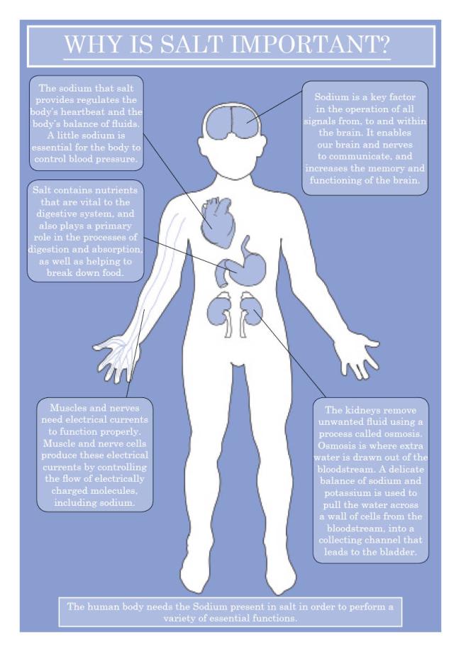
For the second brief of my course, we had to choose one word from the list, and extensively research every element of that word, before choosing one ‘interesting’ fact to base our final piece on. I chose ‘Salt’ and from my research chose to design an educational poster informing students about why salt is a necessity of life.

This was also the first piece of work I created using InDesign, having had no experience of it prior to starting University. I started by creating the main elements in Photoshop (unfortunately at the time I had no access to a Graphics Tablet, so the shapes were created using a mouse only). I created the organs etc using the line tool, before turning them into custom shapes.

I styled my poster on info-graphics, using minimalistic shapes and a simple cool colour scheme (I chose to stay away from loud colours as most often salt-related work is giving warnings and uses bold colours such as red).

Once I had created the main basis for the poster in photoshop (the body outline and organs), I transferred it to InDesign and added the text boxes.
September 2013. Country Brief.

Image

I started the first year of my Graphic Design course in September 2013.

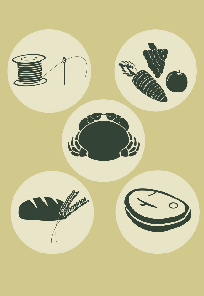
Our first brief was a week long group project groups of around 8 people, where we had to create a concept for a country from scratch. We had to design the related material, such as a name, flag, mascot, and a 10 point manifesto. We also had the option of choosing two other elements to design, such as; currency, a passport, stamps, a monument, a coat of arms, etc.

We based our country on the idea of a “paradise island”, where there is no technology, no tax, no currency. Everything is very simple and very relaxed, and everyone is equal.

After deciding which elements we were going to design, I was allocated the islands interpretation of ‘currency’ (which we decided the equivalent of would be the sign for the market/trading stalls).

We decided to aim for a rustic aesthetic, using simple lines and earthy, natural colours, as well as trying to make it fit with the idea that it could be hand-crafted (ie. stencilled).

I created these images using photoshop, and I feel that they worked well within the project, as well as complimenting to others designs.


Cornish Postcards Brief

Cornish Postcards Brief

April 2013.
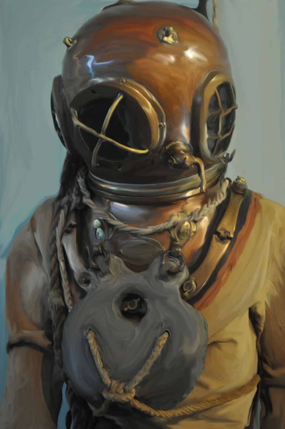
While working on a College-set brief designing postcards for local towns, I decided to experiment with different techniques to generate imagery. I used my own photography and various tools in photoshop to create this image, giving it the appearance of an oil painting. While I didn’t use the image itself in my final pieces, I feel that it could be a useful technique to apply in the future.